class: center, middle, inverse, title-slide # Intro to Visualizations ### Daniel Anderson ### Week 2, Class 1 --- layout: true <script> feather.replace() </script> <div class="slides-footer"> <span> <a class = "footer-icon-link" href = "https://github.com/uo-datasci-specialization/c2-dataviz-2021/raw/main/static/slides/w2p1.pdf"> <i class = "footer-icon" data-feather="download"></i> </a> <a class = "footer-icon-link" href = "https://dataviz-2021.netlify.app/slides/w2p1.html"> <i class = "footer-icon" data-feather="link"></i> </a> <a class = "footer-icon-link" href = "https://github.com/uo-datasci-specialization/c2-dataviz-2021"> <i class = "footer-icon" data-feather="github"></i> </a> </span> </div> --- # Agenda * Quick note on projects and `here::here()` ### Discuss different visualizations * Visualizing distributions + histograms + density plots + Empirical cumulative density plots + QQ plots * Visualizing amounts + bar plots + dot plots + heatmaps --- # Learning Objectives * Understand various ways the same underlying data can be displayed * Think through pros/cons of each * Understand the basic structure of the code to produce the various plots --- class: inverse-blue center middle ### What type of data do you have? -- We'll focus primarily on standard continuous/categorical data -- ### What is your purpose? -- Exploratory? Communication? --- class: inverse-red center middle # One continuous variable --- # Histogram <!-- --> --- # Density plot <!-- --> --- # (Empirical) Cumulative Density <!-- --> --- # QQ Plot Compare to theoretical quantiles (for normality) <!-- --> --- # Empirical examples I'll move fast, but if you want to (try to) follow along, or recreate anything here later, first run ```r remotes::install_github("clauswilke/dviz.supp") ``` --- ### Titanic data ```r head(titanic) ``` ``` ## class age sex survived ## 1 1st 29.00 female 1 ## 2 1st 2.00 female 0 ## 3 1st 30.00 male 0 ## 4 1st 25.00 female 0 ## 5 1st 0.92 male 1 ## 6 1st 47.00 male 1 ``` --- # Basic histogram ```r ggplot(titanic, aes(x = age)) + geom_histogram() ``` ``` ## `stat_bin()` using `bins = 30`. Pick better value with `binwidth`. ``` 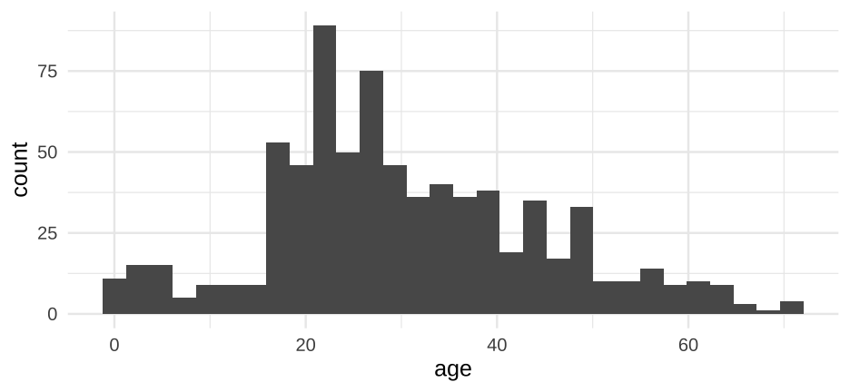<!-- --> --- # Make it a little prettier ```r ggplot(titanic, aes(x = age)) + geom_histogram(fill = "#56B4E9", color = "white", alpha = 0.9) ``` ``` ## `stat_bin()` using `bins = 30`. Pick better value with `binwidth`. ``` 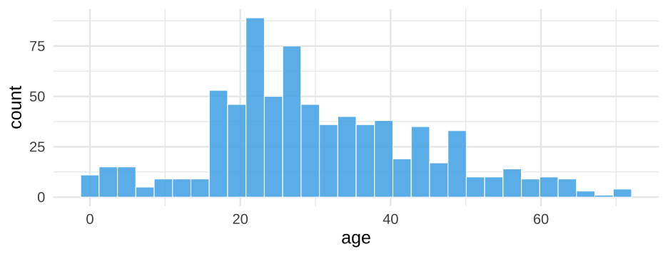<!-- --> --- # Change the number of bins ```r ggplot(titanic, aes(x = age)) + geom_histogram(fill = "#56B4E9", color = "white", alpha = 0.9, * bins = 50) ``` 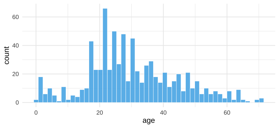<!-- --> --- # Vary the number of bins 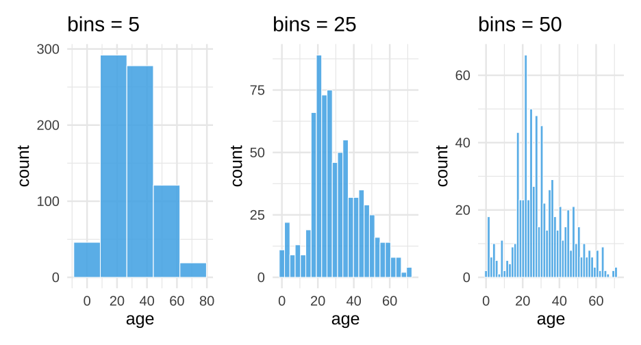<!-- --> --- # Denisty plot ### ugly 😫 ```r ggplot(titanic, aes(age)) + geom_density() ``` 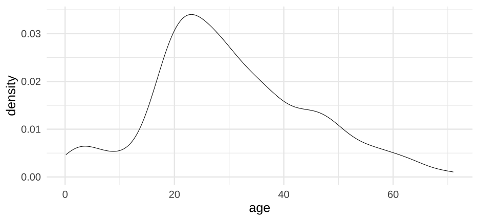<!-- --> --- # Denisty plot ### Change the fill 😌 ```r ggplot(titanic, aes(age)) + geom_density(fill = "#56B4E9") ``` 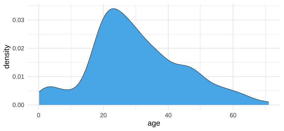<!-- --> --- # Density plot estimation * Kernal density estimation + Different kernal shapes can be selected + Bandwidth matters most + Smaller bands = bend more to the data * Approximation of the underlying continuous probability function + Integrates to 1.0 (y-axis is somewhat difficult to interpret) --- # Denisty plot ### change the bandwidth ```r ggplot(titanic, aes(age)) + geom_density(fill = "#56B4E9", bw = 5) ``` 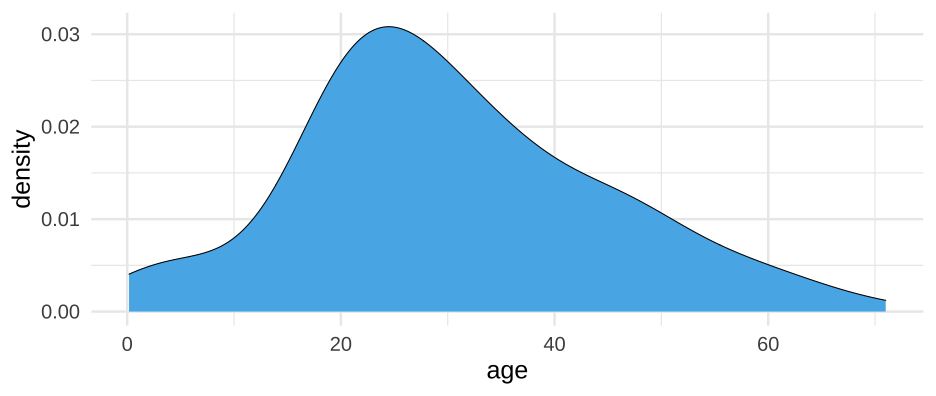<!-- --> --- class: middle 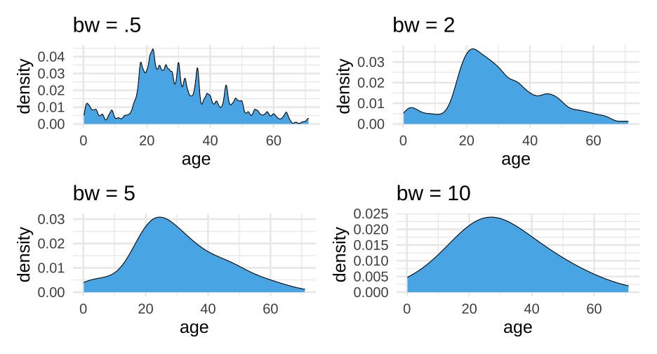<!-- --> --- # Quickly How well does it approximate a normal distribution? ```r ggplot(titanic, aes(sample = age)) + stat_qq_line(color = "#56B4E9") + geom_qq(color = "gray40") ``` <!-- --> --- class: inverse-red center middle # Grouped data ### Distributions How do we display more than one distribution at a time? --- # Boxplots <!-- --> --- # Violin plots <!-- --> --- # Jittered points <!-- --> --- # Sina plots <!-- --> --- # Stacked histograms <!-- --> --- # Overlapping densities <!-- --> --- # Ridgeline densities <!-- --> --- class: inverse-orange center middle # Quick empirical examples --- # Boxplots ```r ggplot(titanic, aes(sex, age)) + geom_boxplot(fill = "#A9E5C5") ``` <!-- --> --- # Violin plots ```r ggplot(titanic, aes(sex, age)) + geom_violin(fill = "#A9E5C5") ``` <!-- --> --- # Jittered point plots ```r ggplot(titanic, aes(sex, age)) + geom_jitter(width = 0.3, height = 0) ``` <!-- --> --- # Sina plot ```r ggplot(titanic, aes(sex, age)) + ggforce::geom_sina() ``` <!-- --> --- # Stacked histogram ```r ggplot(titanic, aes(age)) + geom_histogram(aes(fill = sex)) ``` <!-- --> -- .realbig[🤨] --- # Dodged ```r ggplot(titanic, aes(age)) + geom_histogram(aes(fill = sex), position = "dodge") ``` <!-- --> -- Note `position = "dodge"` does not go into `aes` (not accessing a variable in your dataset) --- # Better ```r ggplot(titanic, aes(age)) + geom_histogram(fill = "#A9E5C5", color = "white", alpha = 0.9,) + * facet_wrap(~sex) ``` <!-- --> --- # Overlapping densities ```r ggplot(titanic, aes(age)) + geom_density(aes(fill = sex), color = "white", alpha = 0.4) ``` <!-- --> -- Note the default colors really don't work well in most of these --- ```r ggplot(titanic, aes(age)) + geom_density(aes(fill = sex), color = "white", alpha = 0.6) + scale_fill_manual(values = c("#009973", "#99ffe6")) ``` <!-- --> --- # Ridgeline densities ```r ggplot(titanic, aes(age, sex)) + ggridges::geom_density_ridges(color = "white", fill = "#A9E5C5") ``` <!-- --> --- class: inverse-red center middle # Visualizing amounts --- # Bar plots <!-- --> --- # Flipped bars <!-- --> --- # Dotplot <!-- --> --- # Heatmap <!-- --> --- # Empirical examples ### How much does college cost? ```r library(here) library(rio) tuition <- import(here("data", "us_avg_tuition.xlsx"), setclass = "tbl_df") head(tuition) ``` ``` ## # A tibble: 6 x 13 ## State `2004-05` `2005-06` `2006-07` `2007-08` `2008-09` `2009-10` ## <chr> <dbl> <dbl> <dbl> <dbl> <dbl> <dbl> ## 1 Alabama 5682.838 5840.550 5753.496 6008.169 6475.092 7188.954 ## 2 Alaska 4328.281 4632.623 4918.501 5069.822 5075.482 5454.607 ## 3 Arizona 5138.495 5415.516 5481.419 5681.638 6058.464 7263.204 ## 4 Arkansas 5772.302 6082.379 6231.977 6414.900 6416.503 6627.092 ## 5 California 5285.921 5527.881 5334.826 5672.472 5897.888 7258.771 ## 6 Colorado 4703.777 5406.967 5596.348 6227.002 6284.137 6948.473 ## # … with 6 more variables: `2010-11` <dbl>, `2011-12` <dbl>, ## # `2012-13` <dbl>, `2013-14` <dbl>, `2014-15` <dbl>, `2015-16` <dbl> ``` --- # By state: 2015-16 ```r ggplot(tuition, aes(State, `2015-16`)) + geom_col() ``` <!-- --> -- .realbig[🤮🤮🤮] --- # Two puke emoji version .realbig[🤮🤮] ```r ggplot(tuition, aes(State, `2015-16`)) + geom_col() + theme(axis.text.x = element_text(angle = 45, hjust = 1, size = 10)) ``` <!-- --> --- # One puke emoji version .realbig[🤮] ```r ggplot(tuition, aes(State, `2015-16`)) + geom_col() + coord_flip() ``` --- 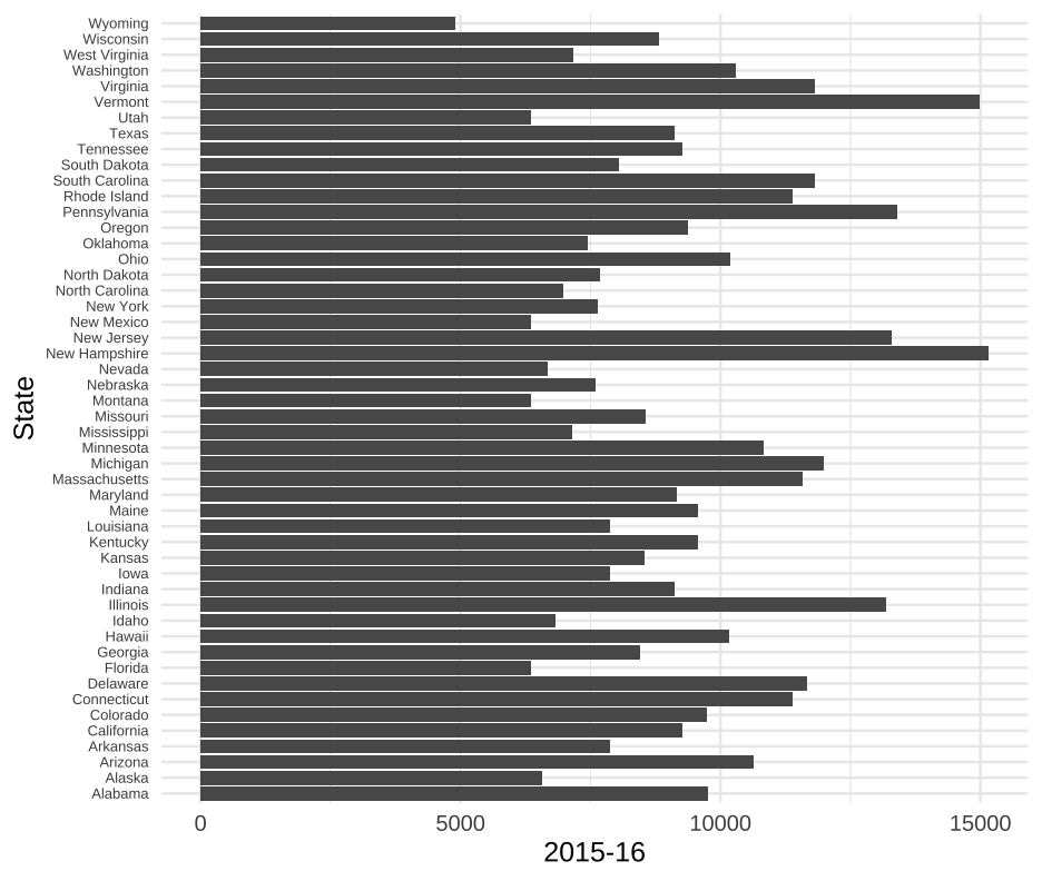<!-- --> --- # Kinda smiley version .realbig[😏] ```r ggplot(tuition, aes(fct_reorder(State, `2015-16`), `2015-16`)) + geom_col() + coord_flip() ``` --- 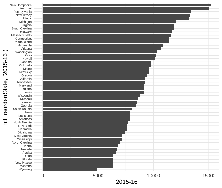<!-- --> --- # Highlight Oregon .realbig[🙂] ```r ggplot(tuition, aes(fct_reorder(State, `2015-16`), `2015-16`)) + geom_col() + geom_col(fill = "cornflowerblue", data = filter(tuition, State == "Oregon")) + coord_flip() ``` --- 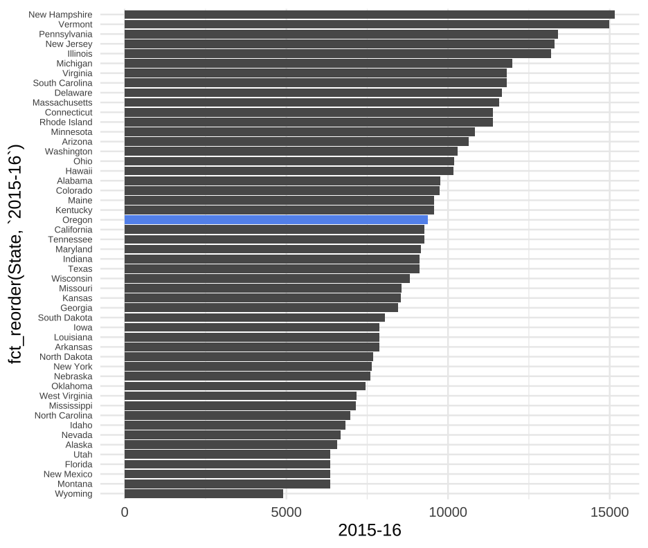<!-- --> --- # Not always good to sort <!-- --> --- # Much better <!-- --> --- # Averages tuition by year ### How? ```r head(tuition) ``` ``` ## # A tibble: 6 x 13 ## State `2004-05` `2005-06` `2006-07` `2007-08` `2008-09` `2009-10` ## <chr> <dbl> <dbl> <dbl> <dbl> <dbl> <dbl> ## 1 Alabama 5682.838 5840.550 5753.496 6008.169 6475.092 7188.954 ## 2 Alaska 4328.281 4632.623 4918.501 5069.822 5075.482 5454.607 ## 3 Arizona 5138.495 5415.516 5481.419 5681.638 6058.464 7263.204 ## 4 Arkansas 5772.302 6082.379 6231.977 6414.900 6416.503 6627.092 ## 5 California 5285.921 5527.881 5334.826 5672.472 5897.888 7258.771 ## 6 Colorado 4703.777 5406.967 5596.348 6227.002 6284.137 6948.473 ## # … with 6 more variables: `2010-11` <dbl>, `2011-12` <dbl>, ## # `2012-13` <dbl>, `2013-14` <dbl>, `2014-15` <dbl>, `2015-16` <dbl> ``` --- # Rearrange ```r tuition %>% pivot_longer(`2004-05`:`2015-16`, names_to = "year", values_to = "avg_tuition") ``` ``` ## # A tibble: 600 x 3 ## State year avg_tuition ## <chr> <chr> <dbl> ## 1 Alabama 2004-05 5682.838 ## 2 Alabama 2005-06 5840.550 ## 3 Alabama 2006-07 5753.496 ## 4 Alabama 2007-08 6008.169 ## 5 Alabama 2008-09 6475.092 ## 6 Alabama 2009-10 7188.954 ## 7 Alabama 2010-11 8071.134 ## 8 Alabama 2011-12 8451.902 ## 9 Alabama 2012-13 9098.069 ## 10 Alabama 2013-14 9358.929 ## # … with 590 more rows ``` --- # Compute summaries ```r annual_means <- tuition %>% pivot_longer(`2004-05`:`2015-16`, names_to = "year", values_to = "avg_tuition") %>% group_by(year) %>% summarize(mean_tuition = mean(avg_tuition)) annual_means ``` ``` ## # A tibble: 12 x 2 ## year mean_tuition ## * <chr> <dbl> ## 1 2004-05 6409.564 ## 2 2005-06 6654.177 ## 3 2006-07 6809.914 ## 4 2007-08 7085.881 ## 5 2008-09 7156.560 ## 6 2009-10 7761.810 ## 7 2010-11 8228.834 ## 8 2011-12 8539.115 ## 9 2012-13 8842.357 ## 10 2013-14 8947.938 ## 11 2014-15 9037.357 ## 12 2015-16 9317.633 ``` --- # Good ```r ggplot(annual_means, aes(year, mean_tuition)) + geom_col() ``` <!-- --> --- # Better? ```r ggplot(annual_means, aes(year, mean_tuition)) + geom_col() + coord_flip() ``` <!-- --> --- # Better still? ```r ggplot(annual_means, aes(year, mean_tuition)) + geom_point() + coord_flip() ``` <!-- --> --- # Even better ```r annual_means %>% mutate(year = readr::parse_number(year)) %>% ggplot(aes(year, mean_tuition)) + geom_line(color = "cornflowerblue") + geom_point() ``` 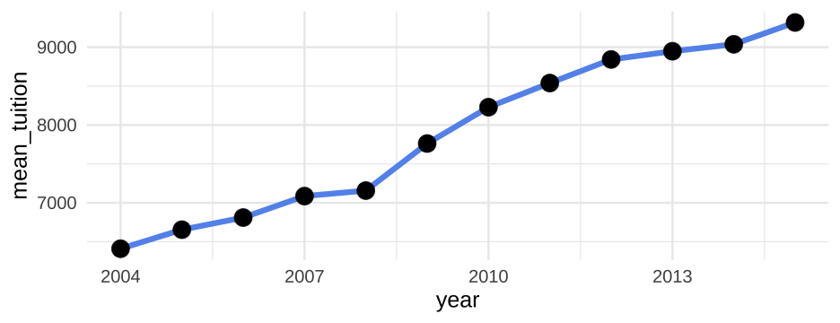<!-- --> -- Treat time (year) as a continuous variable --- # Grouped points Show change in tuition from 05-06 to 2015-16 ```r tuition %>% select(State, `2005-06`, `2015-16`) ``` ``` ## # A tibble: 50 x 3 ## State `2005-06` `2015-16` ## <chr> <dbl> <dbl> ## 1 Alabama 5840.550 9751.101 ## 2 Alaska 4632.623 6571.340 ## 3 Arizona 5415.516 10646.28 ## 4 Arkansas 6082.379 7867.297 ## 5 California 5527.881 9269.844 ## 6 Colorado 5406.967 9748.188 ## 7 Connecticut 8249.074 11397.34 ## 8 Delaware 8610.597 11676.22 ## 9 Florida 3924.234 6360.159 ## 10 Georgia 4492.167 8446.961 ## # … with 40 more rows ``` --- ```r lt <- tuition %>% select(State, `2005-06`, `2015-16`) %>% pivot_longer(`2005-06`:`2015-16`, names_to = "Year", values_to = "Tuition") lt ``` ``` ## # A tibble: 100 x 3 ## State Year Tuition ## <chr> <chr> <dbl> ## 1 Alabama 2005-06 5840.550 ## 2 Alabama 2015-16 9751.101 ## 3 Alaska 2005-06 4632.623 ## 4 Alaska 2015-16 6571.340 ## 5 Arizona 2005-06 5415.516 ## 6 Arizona 2015-16 10646.28 ## 7 Arkansas 2005-06 6082.379 ## 8 Arkansas 2015-16 7867.297 ## 9 California 2005-06 5527.881 ## 10 California 2015-16 9269.844 ## # … with 90 more rows ``` --- class: middle ```r ggplot(lt, aes(State, Tuition)) + geom_line(aes(group = State), color = "gray40") + geom_point(aes(color = Year)) + coord_flip() ``` --- 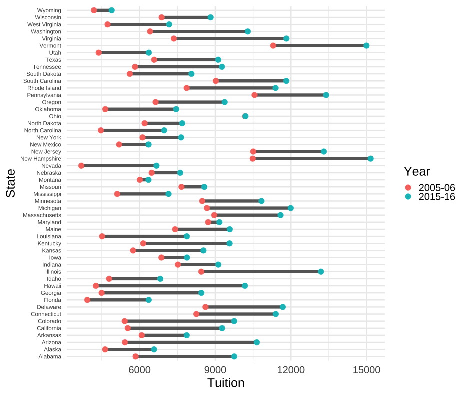<!-- --> --- # Extensions * I know we're probably running short on time, but we definitely would want to keep going here: + Order states according to something more meaningful (starting tuition, ending tuition, or difference in tuition) + Meaningful title, e.g., "Change in average tuition over a decade" + Consider better color scheme for points --- # Let's back up a bit * Lets go back to our full data, but in a format that we can have a `year` variable. ```r tuition_l <- tuition %>% pivot_longer(-State, names_to = "year", values_to = "avg_tuition") tuition_l ``` ``` ## # A tibble: 600 x 3 ## State year avg_tuition ## <chr> <chr> <dbl> ## 1 Alabama 2004-05 5682.838 ## 2 Alabama 2005-06 5840.550 ## 3 Alabama 2006-07 5753.496 ## 4 Alabama 2007-08 6008.169 ## 5 Alabama 2008-09 6475.092 ## 6 Alabama 2009-10 7188.954 ## 7 Alabama 2010-11 8071.134 ## 8 Alabama 2011-12 8451.902 ## 9 Alabama 2012-13 9098.069 ## 10 Alabama 2013-14 9358.929 ## # … with 590 more rows ``` --- # Heatmap ```r ggplot(tuition_l, aes(year, State)) + geom_tile(aes(fill = avg_tuition)) ``` 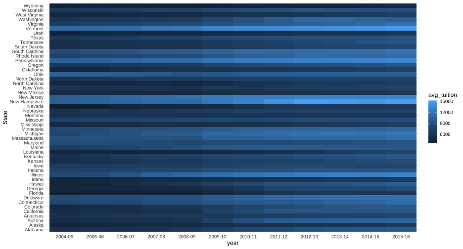<!-- --> --- # Better heatmap ```r ggplot(tuition_l, aes(year, fct_reorder(State, avg_tuition))) + geom_tile(aes(fill = avg_tuition)) ``` 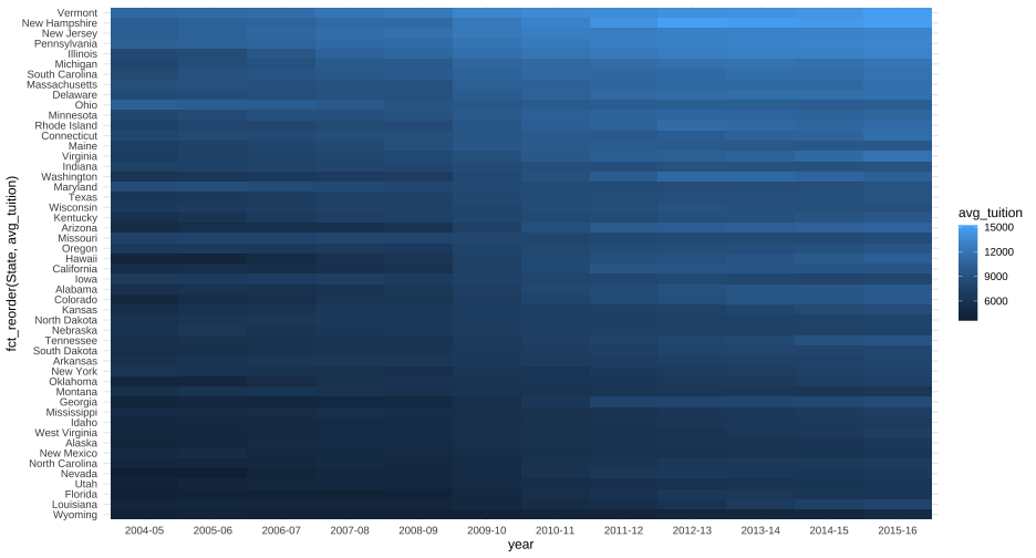<!-- --> --- # Even better heatmap ```r ggplot(tuition_l, aes(year, fct_reorder(State, avg_tuition))) + geom_tile(aes(fill = avg_tuition)) + scale_fill_viridis_c(option = "magma") ``` <!-- --> --- background-image: url(img/heatmap.png) class: inverse-blue bottom background-size:contain --- # Quick aside * Think about the data you have * Given that these are state-level data, they have a geographic component -- ```r #install.packages("maps") state_data <- map_data("state") %>% # ggplot2::map_data rename(State = region) ``` --- # Join it Obviously we'll talk more about joins later ```r tuition <- tuition %>% mutate(State = tolower(State)) states <- left_join(state_data, tuition) head(states) ``` ``` ## long lat group order State subregion 2004-05 2005-06 2006-07 ## 1 -87.46201 30.38968 1 1 alabama <NA> 5682.838 5840.55 5753.496 ## 2 -87.48493 30.37249 1 2 alabama <NA> 5682.838 5840.55 5753.496 ## 3 -87.52503 30.37249 1 3 alabama <NA> 5682.838 5840.55 5753.496 ## 4 -87.53076 30.33239 1 4 alabama <NA> 5682.838 5840.55 5753.496 ## 5 -87.57087 30.32665 1 5 alabama <NA> 5682.838 5840.55 5753.496 ## 6 -87.58806 30.32665 1 6 alabama <NA> 5682.838 5840.55 5753.496 ## 2007-08 2008-09 2009-10 2010-11 2011-12 2012-13 2013-14 2014-15 ## 1 6008.169 6475.092 7188.954 8071.134 8451.902 9098.069 9358.929 9496.084 ## 2 6008.169 6475.092 7188.954 8071.134 8451.902 9098.069 9358.929 9496.084 ## 3 6008.169 6475.092 7188.954 8071.134 8451.902 9098.069 9358.929 9496.084 ## 4 6008.169 6475.092 7188.954 8071.134 8451.902 9098.069 9358.929 9496.084 ## 5 6008.169 6475.092 7188.954 8071.134 8451.902 9098.069 9358.929 9496.084 ## 6 6008.169 6475.092 7188.954 8071.134 8451.902 9098.069 9358.929 9496.084 ## 2015-16 ## 1 9751.101 ## 2 9751.101 ## 3 9751.101 ## 4 9751.101 ## 5 9751.101 ## 6 9751.101 ``` --- # Rearrange ```r states <- states %>% gather(year, tuition, `2004-05`:`2015-16`) head(states) ``` ``` ## long lat group order State subregion year tuition ## 1 -87.46201 30.38968 1 1 alabama <NA> 2004-05 5682.838 ## 2 -87.48493 30.37249 1 2 alabama <NA> 2004-05 5682.838 ## 3 -87.52503 30.37249 1 3 alabama <NA> 2004-05 5682.838 ## 4 -87.53076 30.33239 1 4 alabama <NA> 2004-05 5682.838 ## 5 -87.57087 30.32665 1 5 alabama <NA> 2004-05 5682.838 ## 6 -87.58806 30.32665 1 6 alabama <NA> 2004-05 5682.838 ``` --- # Plot ```r ggplot(states) + geom_polygon(aes(long, lat, group = group, fill = tuition)) + * coord_fixed(1.3) + scale_fill_viridis_c(option = "magma") + facet_wrap(~year) ``` <!-- --> --- background-image: url(img/states-heatmap.png) class: inverse bottom background-size:contain --- class: inverse bottom right background-image: url(img/states-heatmap-anim.gif) background-size:cover # Or animated --- class: middle # Wrapping up * We've got a ways to go - today was just an introduction * The geographic part in particular was too fast, and we'll talk about better ways later (note that Alaska/Hawaii were not even included) * We basically didn't talk about multivariate data (not even scatter plots) * Other types of plots will be embedded within the topics later in the class --- class:inverse-green # Next time ### Lab 2 git/GitHub collaboration It's already posted - feel free to start working on it whenever. * Must be completed as a group * Will use elements of what we talked about today, while also asking you to create branches, submit pull requests, etc.