Lab 1
Lab Assignments
Overview
The purpose of this lab is to get you working with git and GitHub collaboratively, as well as to refresh some basic {dplyr} skills. You should work together in groups of 3-4.
The basics of the lab are to:
- Create a shared repo
- Create an R Markdown document
- Work on a few different data visualizations together
- File issues for the different pieces of the lab
- Create branches for those issues
- Different people work on different branches - merge them in when you’re ready
- Submit a link to the repo through Canvas when you’ve completed the lab
- I check the commit history, and give each person credit
To receive full credit you must create and merge branches. The contributions across team members should also appear roughly equal.
Data
We’ll work with Week 1 of the #tidytuesday data for 2019, specifically the #rstats dataset, containing nearly 500,000 tweets over a little more than a decade using that hashtag. The data is in the data folder of the course repo.
Project
Glance through the plots below. This is an open-ended lab. You need to work with your group to figure out how to best approach this. By the end, however, you should have:
-
A shared GitHub repo
-
Initial versions of each of the two plots
-
Final versions of each of the two plots
-
At least two branches, each of which have been merged in
Each person should be responsible for at least one commit.
Plot 1 rough draft
Create the following plot:
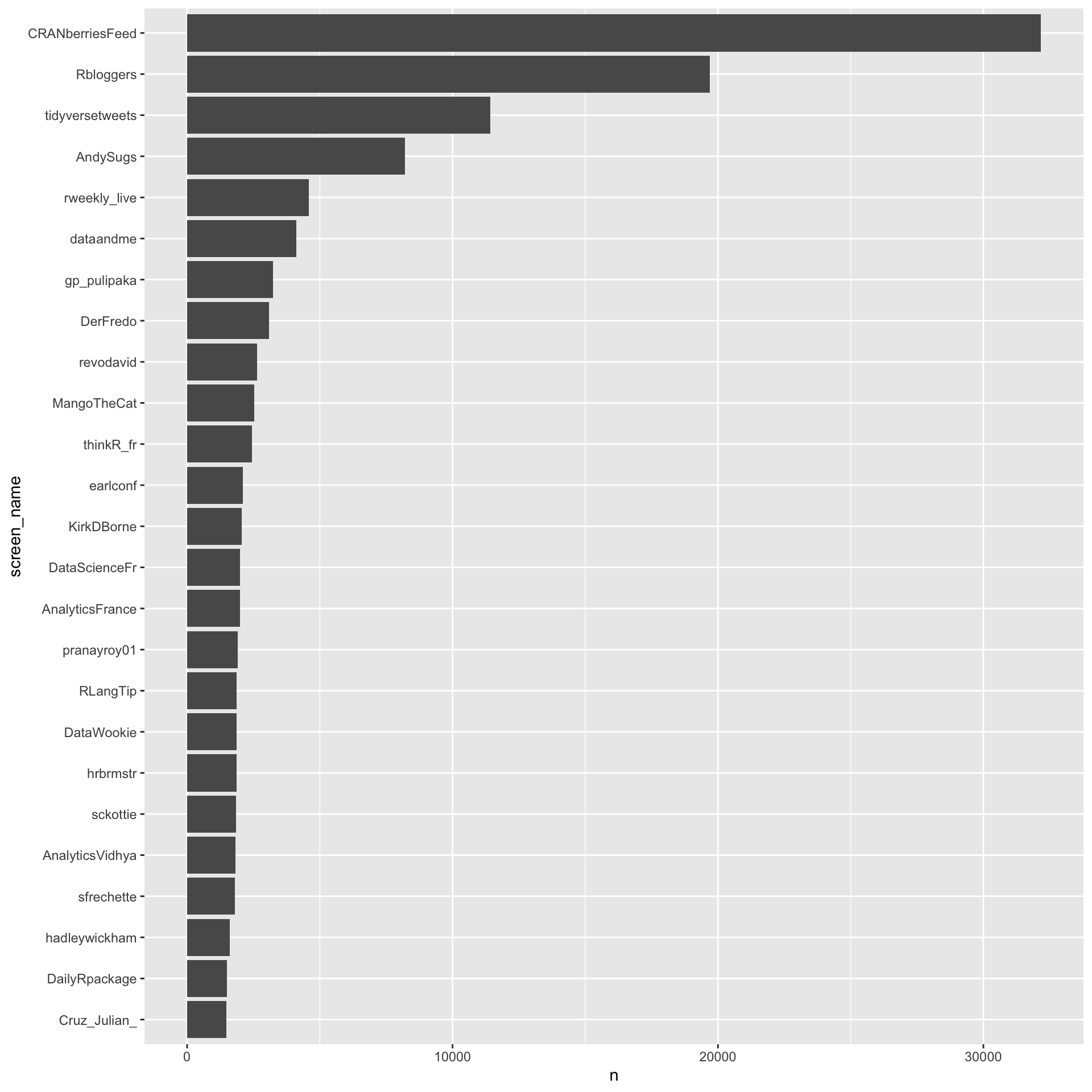
Some guidance
- You’ll want to count the number of times a screen name appears and select
only the top 25.
- Consider arranging in descending order, then using
dplyr::slice
- Consider arranging in descending order, then using
- Make the screen name a factor, ordered according to the number of times
it appears.
- Consider
forcats::fct_reorder
- Consider
coord_flipwill be your friend here
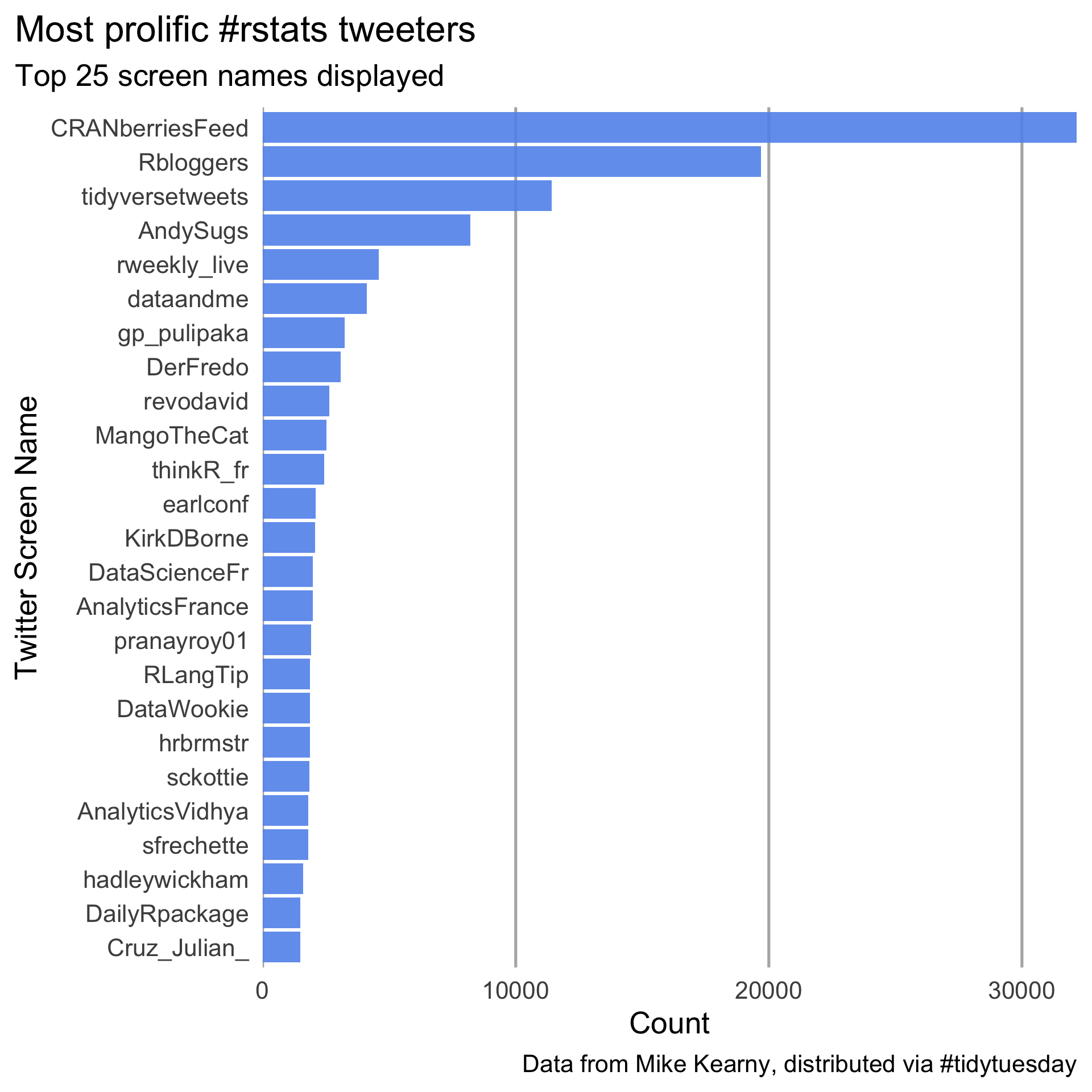
Finalized Plot 1
Style the plot so it (mostly) matches the below. It does not need to be exact, but it should be close.
Plot 2 rough draft
Create the following figure.
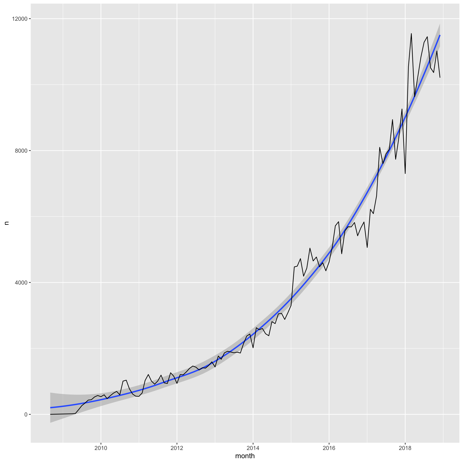
Some guidance
- First create a
monthvariable that rounds thecreated_atcolumn to the nearest month. You might considerlubridate::round_date. - Restrict the count to prior to 2019. I would recommend using
lubridate::as_datetime("2019-01-01 00:00:00"), or just restricting the x-axis throughggplot - Count the number of rows (tweets) in the dataset for each month
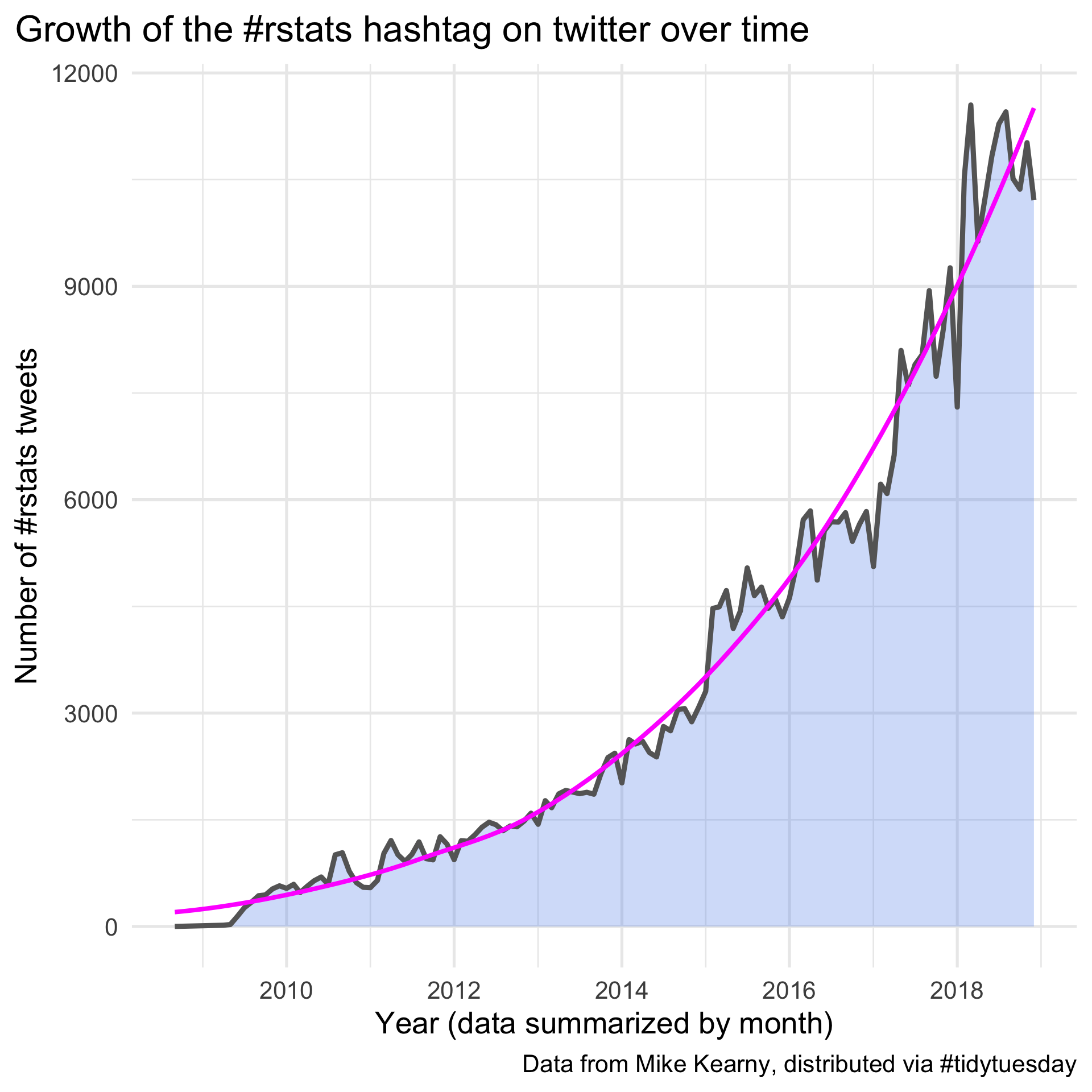
Finalized Plot 2
Style the plot so it (mostly) matches the below. It does not need to be exact, but it should be close.
Finishing up
It is expected that this lab will take you more time that the 80 minutes we have in class. Class time should be used to clarify any points of confusion and if you run into issues after class, please get in touch with me so we can arrange a time to meet and I can help you.
Once you have finished, please go to Canvas and submit a link to your shared repo. Credit will be awarded based on the commit history.